Let’s get started on the content of your business card.


Business cards present information to potential customers, and the font choices that deliver that information can have an impact on the reader. A minimalist card with a bombastic font can easily draw attention to business names or titles, while a card chock full of information needs to have a clear and efficient font. The font choice is aesthetic, but largely meant to create an effective presentation for your customer.
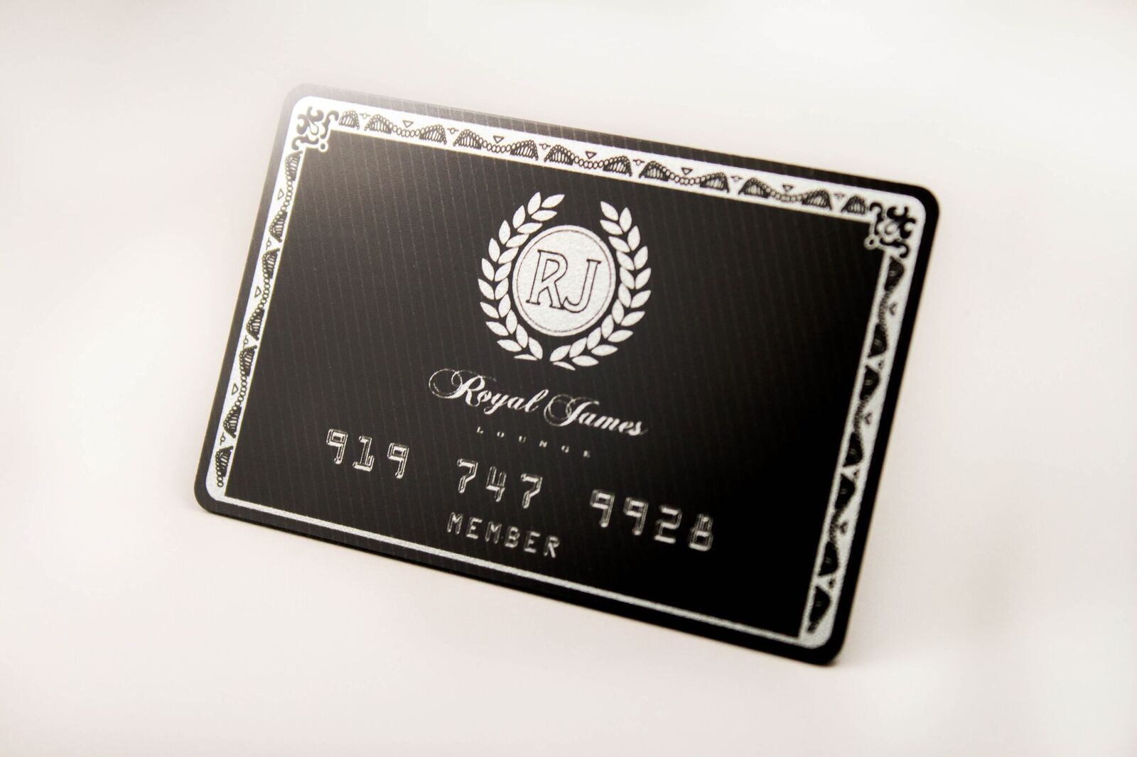
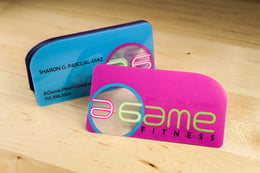
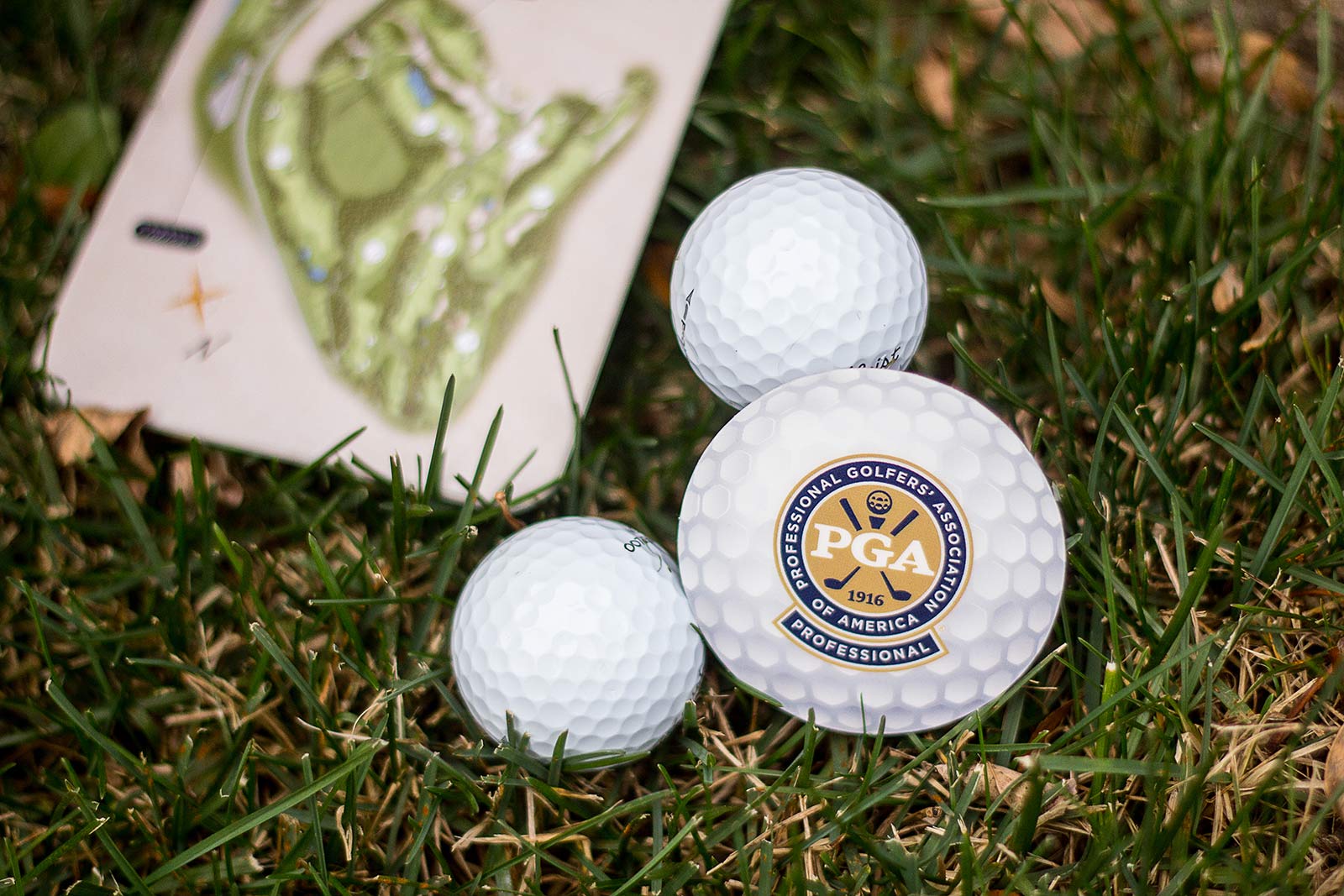
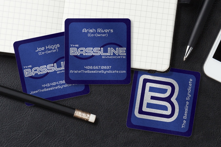
Color can be an eye-catcher, and color can be a compliment, it’s all up to your brand. If your brand or business has clear colors, your business card design should use those colors to create a consistent brand in the mind of your customers. Color can also be used to brighten your card, darken your font, and generally draw attention to your card and away from the many others your customer may also be receiving.
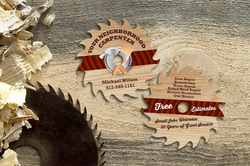
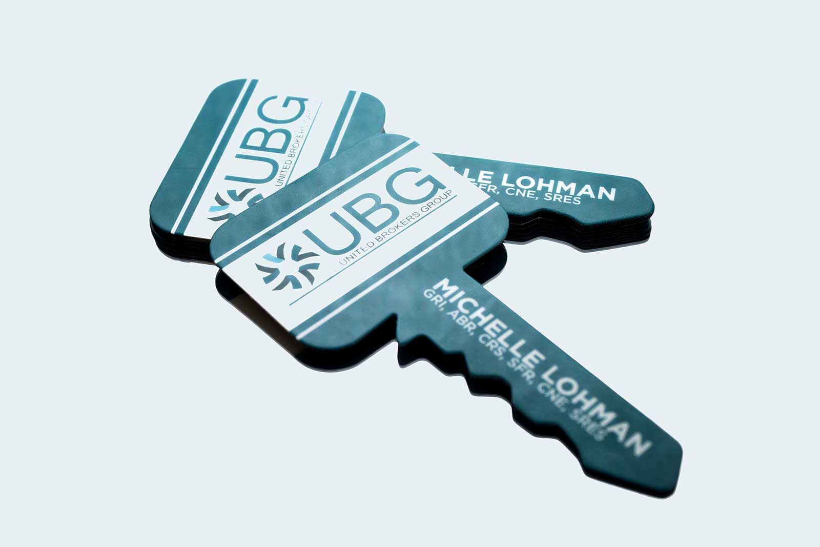
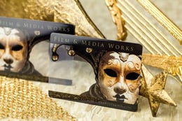
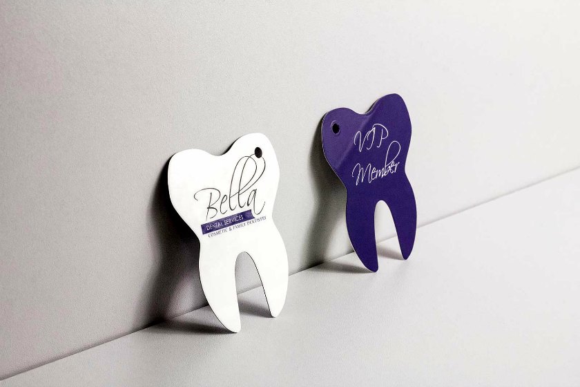
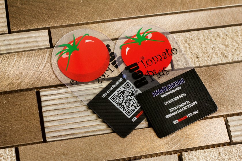
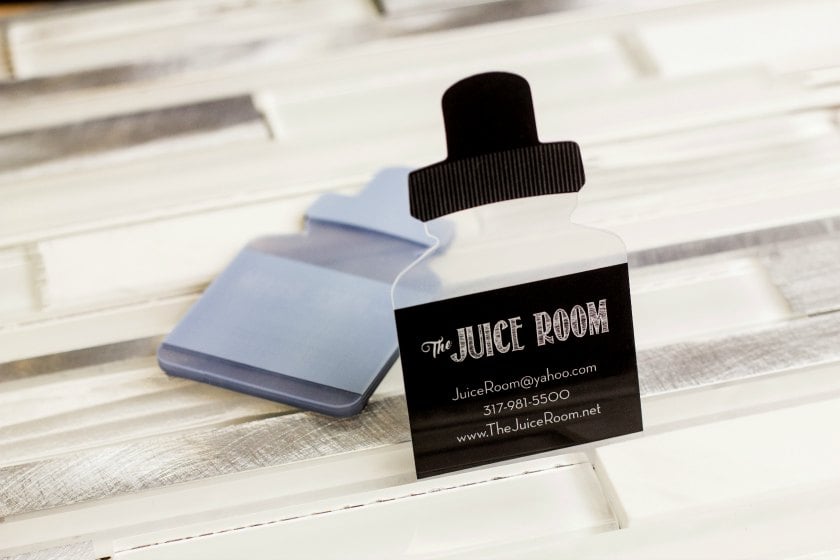
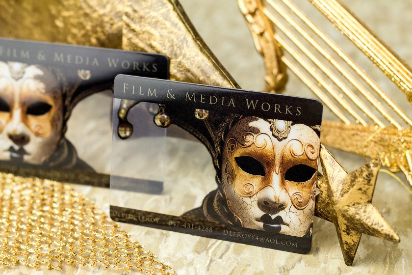
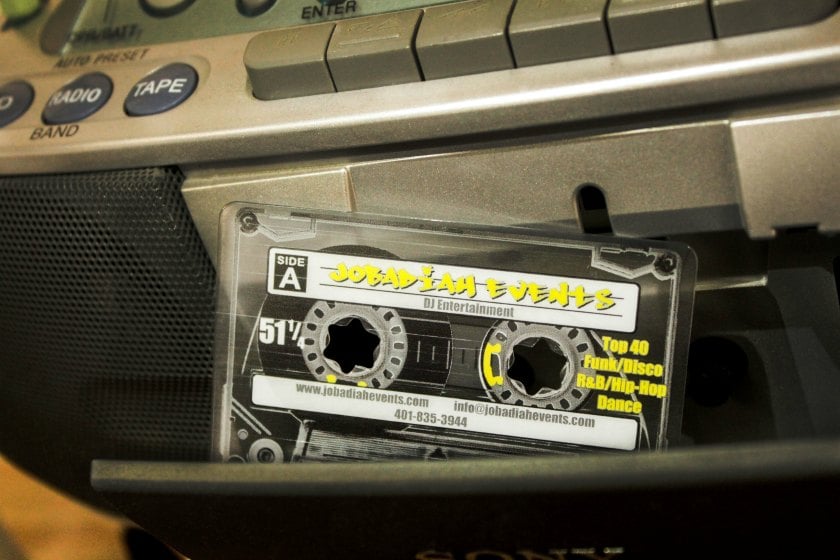
Your card can present information to your potential customers before you even hand it to them. Shapes can reflect what you do, and can certainly keep your card in the forefront of the client’s mind. Coffee shops could have coffee cup-shaped cards, photographers could have camera-shaped cards. Custom shapes are one way for you to tell people what you do before they even read the card.
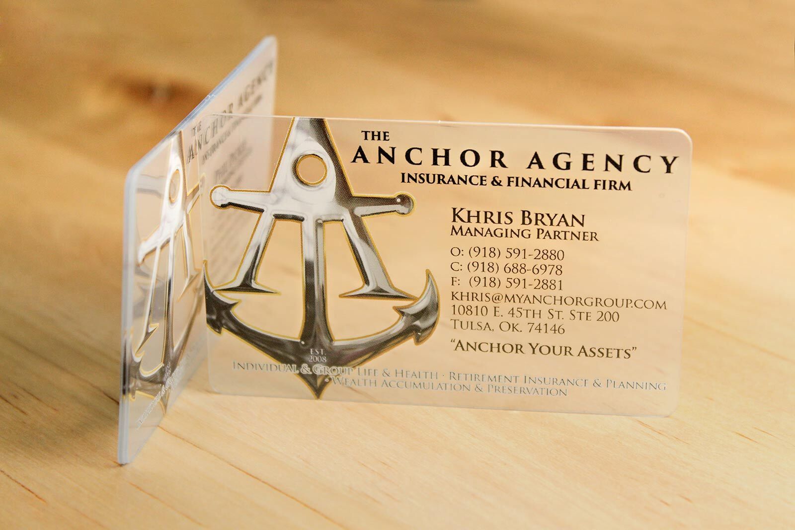
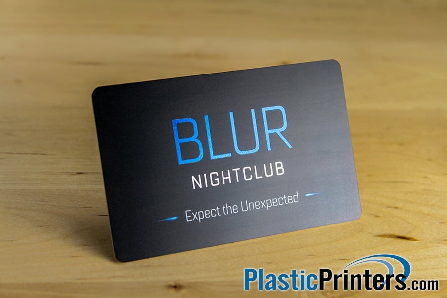
You can draw more attention to your content and maybe even elevate your aesthetics by applying finishes to your text. For example, you can emboss your text, which grants it a 3D effect that keeps the reader engaged, or you could foil your text, adding an eye-catching shine to your content. Finishes are in service of adding an extra kick to your content, and drawing your potential clients directly to your information..
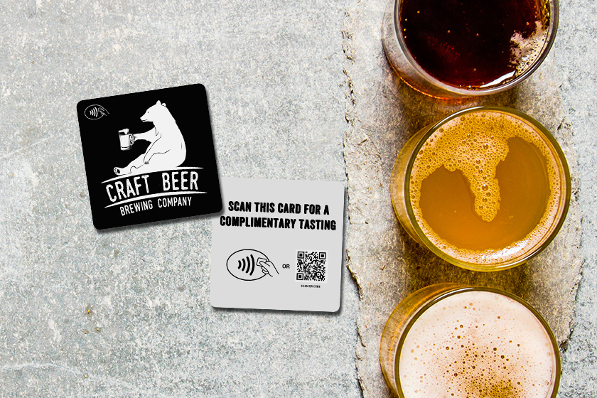
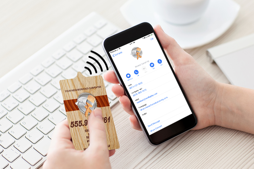
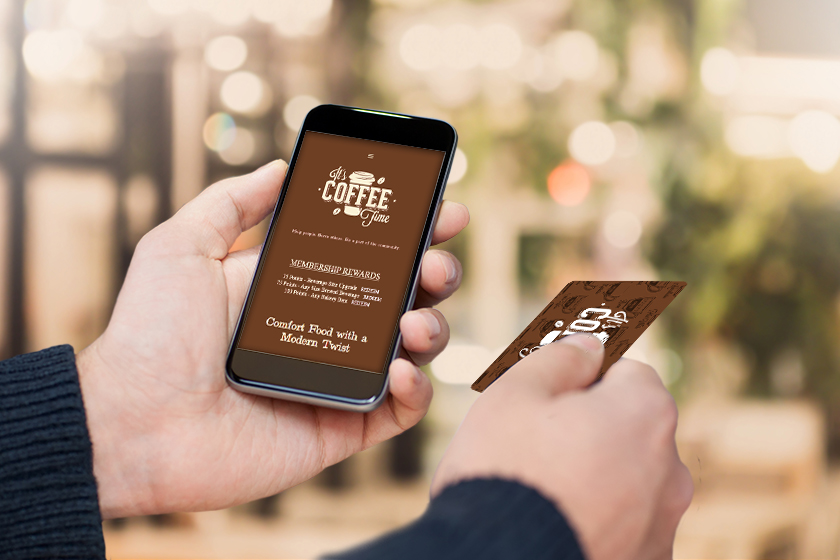
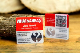
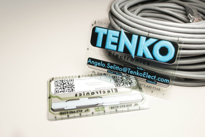
What content and information your card can present has been forever changed. Equipped with near-field communication (NFC), your business card can now deliver your contact information, social networks, video, websites, and so much more, straight to any smartphone. You can easily customize and update the information you send to your clients and prospects. You can customize and update the card’s content; they’re incredibly easy to share, they’re great for contact management, and they stand out from the crowd. If you want your card to open your businesses website, or open a schedule to create a meeting, NFC make your networking a whole lot smoother.
.jpg)