If you are like many busy businesspeople, you probably don't have a whole lot of time to work on creating a fantastic looking business card for yourself. In reality, it's so important to have a card that accurately reflects you and your brand so that anyone you hand it to can get an idea of what you do just by a glance.
So if you don't have the time, what do you do? Hire a graphic designer? Get a template that looks like everyone else's paper business card on the market? Sometimes you also don't have the money to spend on hiring an expensive graphic designer. So if you're going down the beaten path of creating your own business card from scratch, we've put together 5 great tips to keep in mind when working with the fonts on your card.
Your business card defines you
Typography on a business card is almost as important as what you put on the card. It defines you and your business brand, what kind of message you want to send, and what kind of business you want others to see. It gives your business card life, a certain "mood", so you don't want to give away the wrong feeling. After all, driving away your target market could be one of the worst business mistakes an entrepreneur could make!
1. Don't overdo it.

While it's important that you convey what your business or services are all about, you don't want your business card to be cluttered with text that potential customers and clients could get lost in. Make it short-and-sweet, give your basic information, what your company can do for them, and how to contact you.
2. Keep the number of font varieties to a minimum
If you don't want your business card to look cluttered (hint: you don't), it's a good idea to keep the number of font varieties to a minimum. 2 to 3 is usually a good limit, but it may be beneficial for you to only use one. If your logo has a font associated with it, you can try to match the other fonts to it, or go in a different direction. As long as it coincides with tip #3. Speaking of tip #3...
3. Use a font that matches the company's look and feel
There are hundreds of millions of fonts out in the world, but that doesn't mean that you should choose one at random, even if you do feel overwhelmed by your options. Beleive it or not, fonts can evoke a certain emotion or "feeling" when you look at them. It's important that you consider what kind of feeling you want others to have when they look at your card. Do you want them to feel relaxed and serene (a spa, for example)? Do you want them to feel reassured and secure (a law office)? There are many options that you can choose from, so make sure it is the right decision.
4. Make sure you can read it
What good is a business card if you can't read any of the information? Many novice mistakes can be made with this tip, for example choosing the wrong color combinations so that the type blends together, putting too much text together in one spot, or using a font size that is way too small. Keep in mind the audience that you are going to be handing these cards to -- for example, if your target market is the senior community, perhaps a larger and bolder font could help those hard of seeing to easily read your information.
5. Consider color
Last but definitely not least, make sure that you take color into consideration. This is a huge role on some of the other tips we've covered today. The color of font can affect the feel, readability, and simplicity of your card. Too many colors can create a jumbled mess, but can also convey a certain feeling if you are going for that.
All in all, there are tons of other tips and tricks to think about when designing your first business card. If you follow these basic tips, your card will already be above and beyond many others in your field!
If all of this overwhelms you, don't worry about it! Our graphics team at PlasticPrinters.com can create a great looking card for you at a cost that won't break the bank!
For those of you who have already created a business card, what other typography tips do you have, or what did you find worked well for your card?
.png?width=534&height=632&name=White%20Aesthetic%20Vision%20Board%20Instagram%20Story%20(1).png)
Share this
Affordable Ways to Keeping Your Business Cards Current
-resized-600.jpg)
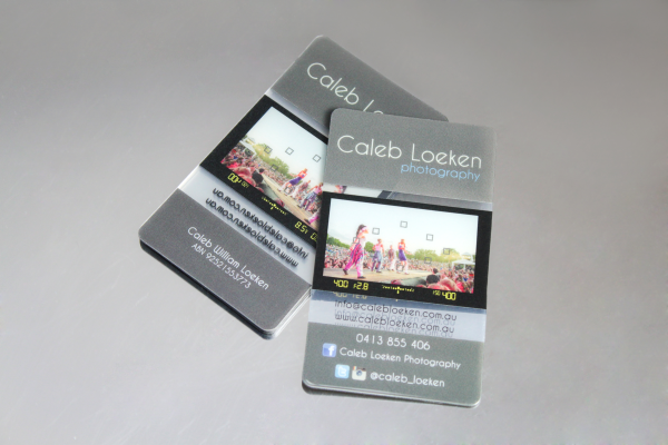
Photographer Business Cards That Click