When you think of your business card, is the first thing you think about the color? It may not be, but it's a very important factor in your card that should definitely not be overlooked. There are many emotions and feelings that are attached with different colors and you want to make sure that whatever feeling you want associated with your business is not being misconstrued by something as simply fixed as wrong color choices.
Sara Duane-Gladden from the smartpress.com blog has a great color graphic and blog post that gives some great tips and tricks on what you should look for when choosing your colors:
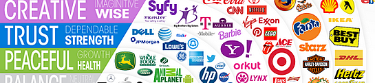
- Yellow - Associated with optimism and warmth. Companies like Subway, McDonalds, National Geographic, and more use this color in their logo
- Red - Excitement and Boldness go with this color. Target, Ace, Kellogg's, Coca-Cola and more utlize this color
- Blue - Trust and Strength are greatly associated. Companies like Blue Cross Blue Shield, HP, Vimeo, Facebook and more hopped on blue for their logo colors
- Green - Associated with peace and calmness. Animal Planet, Tropicana, Starbucks, and Whole Foods are among many to use green in their logos
There are many more color associations that you can consider when picking a scheme for your business cards. Take a look at the easy to use graphic in the original article, you can find the link after the jump!

.png?width=534&height=632&name=White%20Aesthetic%20Vision%20Board%20Instagram%20Story%20(1).png)
Share this
7 Ways to Make Your Business Card Stand Out
Affordable Ways to Keeping Your Business Cards Current